
To change the order of your columns on responsive display you only need do add a CSS rule to the row containg the colulms.
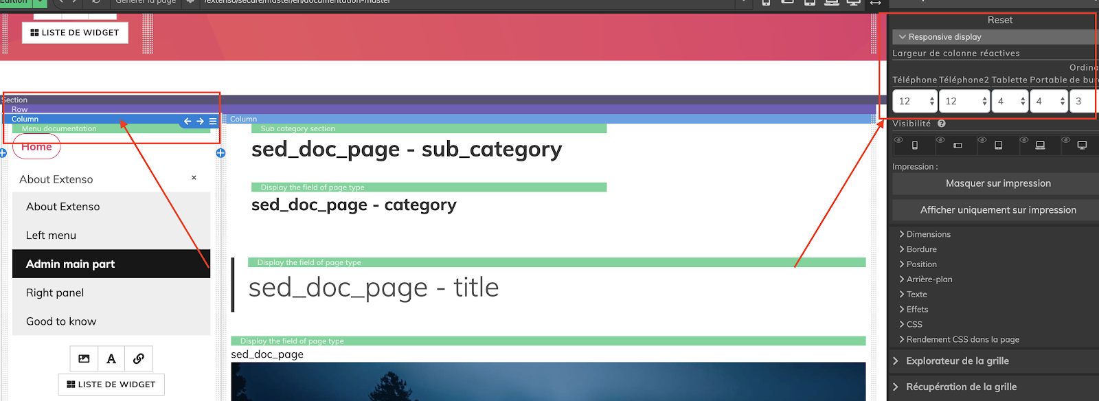
Add two columns inside the row.
Add the size of each one of this columns under the Responsive Display menu (underProperties of the column).
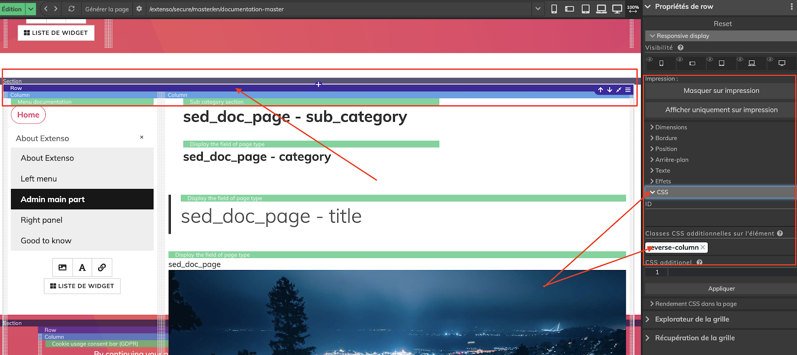
Select the row inside the grid, go to Row Proprieties menu ; click under the CSS dropdown and add a class to the row element.
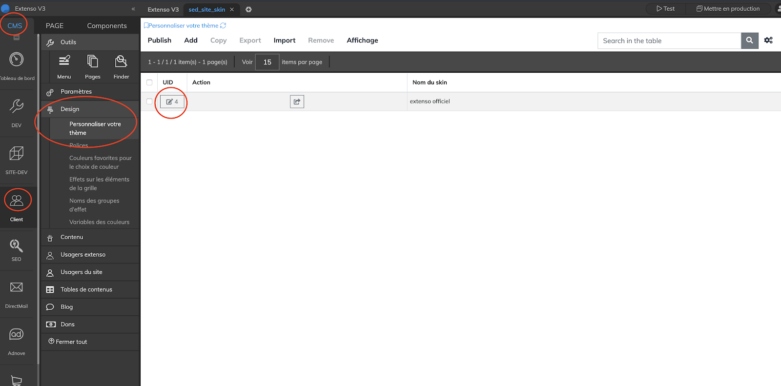
Then, add the CSS rule `flex-direction: row-reverse`` to this class. To do so, go to Client menu, click under Design and then under Customize your theme. Select the stylesheet, add the CSS rule and Publish the page.
NOTE: You will need to empty your cache to actualy see the changes you just made.
Go back to the grid, you'll see that the order of your columns have changed. You only have to replace the column at its correct place.
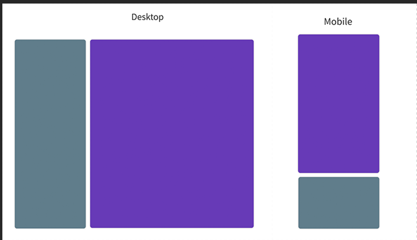
To test the result, publish de page. You will note that the left column will appear after the right column on mobile display.
