

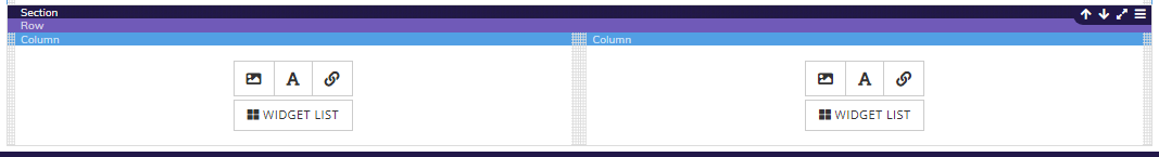
This is used to delimit your work area. This represents the backdrop of the site. As you add items, the section will lengthen accordingly. A page can also contain several sections, one after the other. The section can be full width or have a fixed width.
They are used to organize the elements horizontally in the section. Several rows can be inserted in the same section. A row can also be full width or have a fixed width.
Like rows, columns are used to organize the elements, but this time vertically. Several columns can be inserted in the same row. We have a 12-columns model for our grid. The total number of columns must therefore be equal to 12. Ex .: (3 columns of 4 = 12 or 1 column of 7 + 1 column of 5 = 12)
Columns are also used to customize your content for different browsers (Tablet, mobile and computer) Responsive Web design (RWD) is a Web design approach aimed at crafting sites to provide an optimal viewing experience—easy reading and navigation with a minimum of resizing, panning, and scrolling—across a wide range of devices (from mobile phones to desktop computer monitors).
In any column, you can insert components. The components library is accessible by clicking on the status bar of a column. The library access icon will appear at the bottom of the column.
